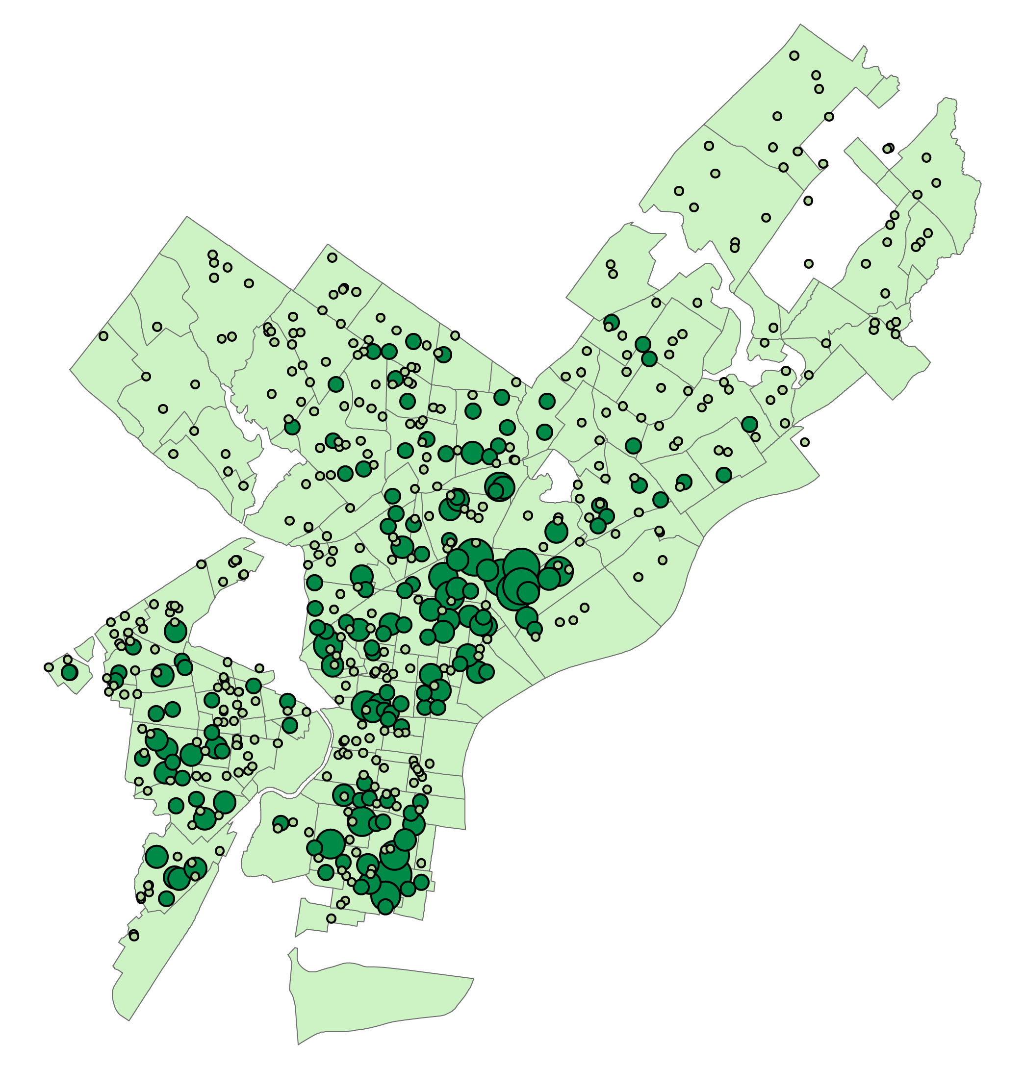
Visualization of Narcotics Arrests Near Rail Infrastructure
Intro
This choropleth map was created as the final project for my Fundamentals of GIS class, using ArcGIS Desktop 10.5.1.
Living in Kensington, I have close proximity to people struggling with addiction to opiates, and the associated affects such as homelessness, and it seems to cluster around rail infrastructure. Using a variety of publicly available spatial datasets, I created a choropleth map to visualize the amount that drug-related arrests cluster around both the Market-Frankford El and commuter and freight rail infrastructure.
Study Area
This analysis focused primarily on North Philadelphia and Kensington, where the Conrail tracks along Lehigh Avenue intersect with the Market-Frankford El. For context, data was generated for the whole city.
Data
The Pennsylvania Geospatial Data Clearinghouse (PASDA) and OpenDataPhilly both provided data for this study: Datasets provided by PASDA included: Philly Watersheds hydrographic features, Septa Market Frankford Line route and stations, PA Rail Lines 2018, PA State Roads 2018 and Philly Police District Boundaries 2016. The Dataset provided by OpenDataPhilly was a set of crime incidents from 2006-2018.
Methods
To prepare, I added all relevant data to the project, and reprojected all data to State Plane Pennsylvania South. I also clipped the rail and watersheds layers to the District Boundaries layer, which excluded all info outside of the City of Philadelphia.
Next, using the split tool from the editing toolbar, I began cutting the rail lines at police district borders. By breaking the rail lines up by district, this enables me to compare data with the district as a whole.
I then merged the rail and Market Frankford El layers into one, and applied a 1000 foot buffer, to include data from approximately two blocks on either side of the rail line.
The crime incidents dataset from OpenDataPhilly included many categories of crime for 12 years, so reducing this data was necessary. I selected only the incidents described as “Narcotic / Drug Law Violations”, and exported only those incidents into a new layer.
I performed a Spatial Join between the Narcotics incident point data and the District Boundaries Polygon layer, which gave me a count of incidents per district. I calculated the area in Square Miles for each district, and divided this count by the area to provide the ability to compare polygons with different dimensions. I repeated all of these steps with the rail buffer. This gave me normalized counts of narcotics incidents within a 1000 foot buffer of rail lines, and the surrounding district, which should make comparing this data more reliable.
I then created a choropleth map for each set of data, using the same color ramp for both. One challenge I faced in this section was the distribution of data. The rail buffer included two very large, but important outliers, which made classification by equal interval problematic. Natural breaks seemed to fit the data distribution nicely, but could make comparing between the two choropleth maps problematic. To work around this, I used natural breaks to classify the data in the rail buffer into seven categories. I then manually classified the Police District choropleth map into five categories, matching the first five breakpoints. The end result of this is that there are two overlayed choropleth maps with the same data distribution, one of which has two additional categories.
At this point, laying out the maps and improving readability was left. I added in point data for the el stops, and cloned this layer into one with a reduced set of points and labels enabled. This allowed me to label some el stops without cluttering the map. To further assist with orientation and make better use of empty space, I turned on labels on the rail lines, added waterways, and on the large scale map, I added state roads.
Results
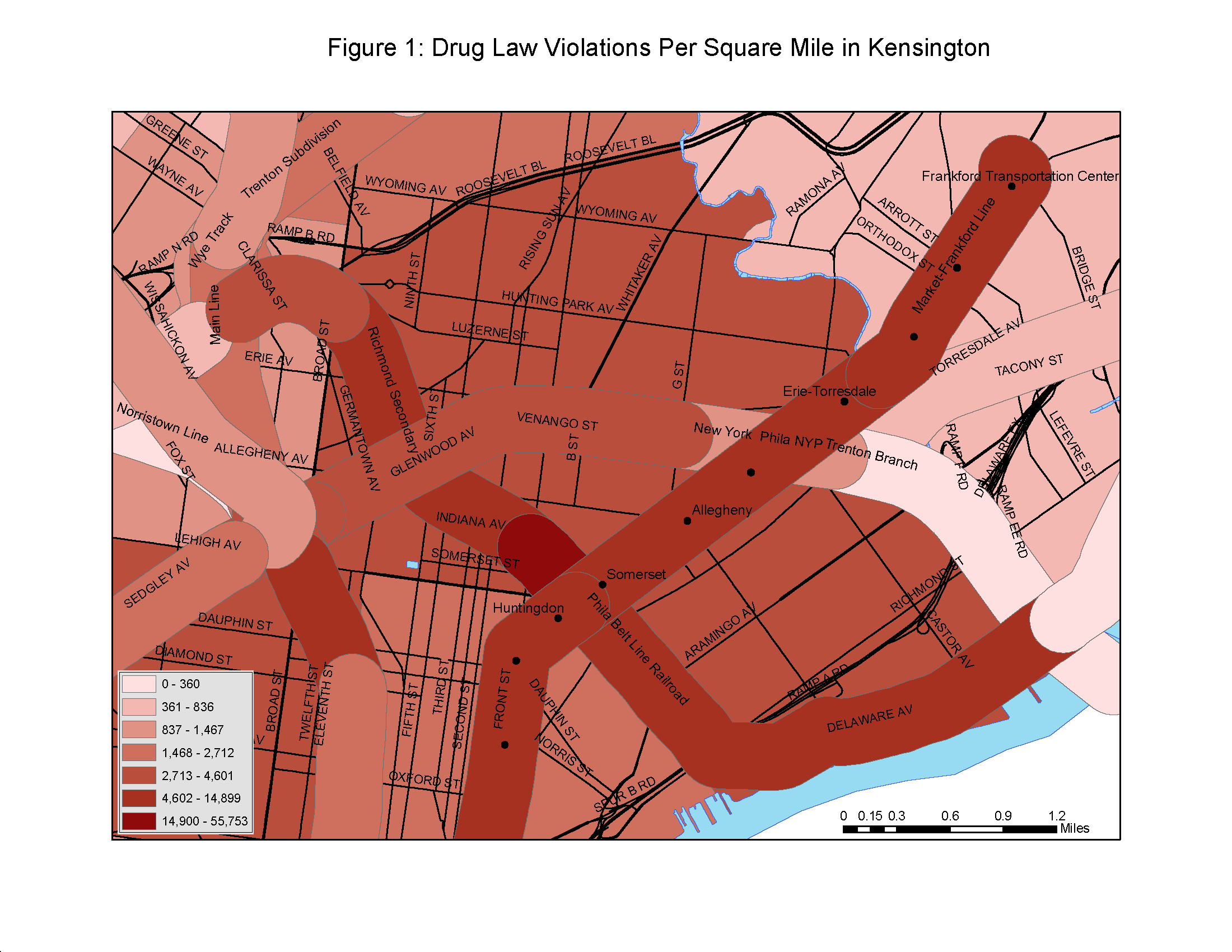
- Figure 1 provides a large-scale map of the study area.
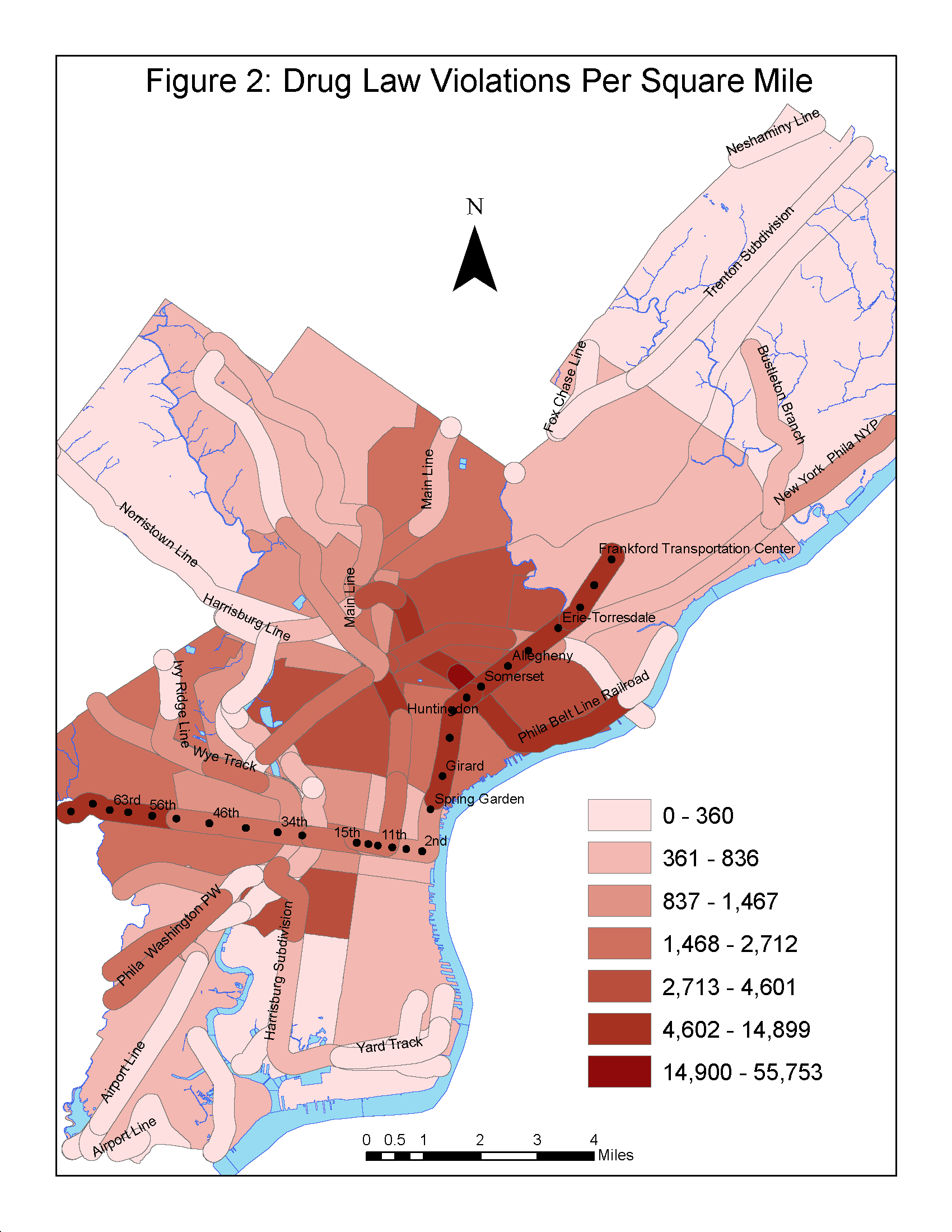
- Figure 2 is a smaller scale map of the City of Philadelphia to provide context around the study area.
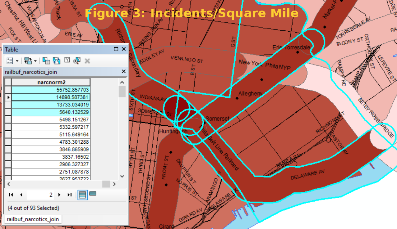
- Figure 3 highlights the four polygons with the highest density of narcotics arrests per square mile.
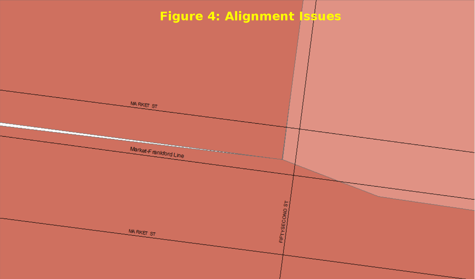
- Figure 4 is a close up of alignment issues in West Philadelphia that I ran into when trying to split rail lines
Discussion
There has been some press coverage in the past year of the Conrail-owned line labeled “Phila Belt Line Railroad” on Figure 1 as a refuge for people struggling with opiate addiction. The portion between the el and Second Street is below grade, and there was a wide path of easily accessible overgrown land alongside the infrequently used tracks. Because of these factors, a semi-permanent community had developed from people without steady housing, most of whom were fighting addiction. One of the reasons this community was able to develop so much was a lack of eyes on the street. The overgrown below-grade land is hard to see from the street, and there are a number of large industrial properties bordering it, so there are challenges monitoring the area.
This area is clearly visible on the map in Figure 1, in the highest class of incidents per square mile. Looking at Figure 3, we see that the four polygons with the highest number of narcotics arrests per square mile are all adjacent to this one, and they are mostly concentrated in two police districts.
As of summer 2017, the City of Philadelphia and Conrail worked to relocate the people, clear the overgrowth, and provide better fencing around the perimeter of the property. One of the effects of this work was to displace many of the people further down the line. Following the same Belt Line Railroad east to the other side of the El, the tracks become elevated over street level, which creates a large wall on the north side of Lehigh Avenue. The four or five roads that pass under this viaduct do so through small, poorly lit tunnels. Providing protection from the elements and privacy from eyes on the street, these tunnels became the natural next stop after the other encampment was cleaned out.
The raised sections of the Market-Frankford el are east of Spring Garden, and West of 40th street. These sections also have elevated incidents of drug use, although the physical environment is different. The El infrastructure is much less bulky and isolated than the older heavy rail, so there are generally more residential and commercial uses close to the tracks, and much better visibility of the surrounding area. This would suggest that the el has a different set of challenges than the heavy rail. The sections of the el with elevated narcotics incidents also tend to pass through sections of the city with higher poverty, so it’s possible that the combination of poverty, lack of economic opportunity, and a high density of people provide a reason for people selling narcotics to cluster in these areas.
One challenge with this analysis is that this data is an aggregation of all narcotics arrests, so I assume it includes the full spectrum, from individuals smoking marijuana to someone selling heroin and fentanyl. A more fine-grained dataset could provide better insight into the incidents most likely to provide health and safety concerns, both for the users and the surrounding community.
Another challenge with this analysis is that using police districts as boundaries for the divisions could potentially smooth over areas with a high incidence of narcotics arrests. Districts such as the 14th in Northwest Philadelphia are very large, and cover an enormous variation in household income and population density. Repeating this analysis at the level of neighborhood or census tract may provide more fine-grained data.
Figure 4 demonstrates a complication I ran into with the alignment of a few layers in West Philadelphia. When I was first developing the methodology for this analysis, I tried a few procedures to automatically cut the rail lines at district boundaries. These generally broke down along Market Street in the area of 52nd Street. Three layers providing Market Street, the Market-Frankford El, and the police district boundaries all appear to align correctly, but the rail lines were all being split in unexpected places. When zoomed in far enough, it became clear that the different GIS features do not precisely align with each other, although they initially appeared correct.
One area for further development with this analysis is time. The dataset used for this analysis included incidents from 2006 – 2018, so it is a large aggregation of incidents. Repeating this analysis for multiple years could expose trends over time. This could be especially important for opiate-related issues, considering the amount of change that we have seen in the past few years.


